So starts the new module. Starting off with words distributed from the magical device known as the 'Randomizer' we each had 3 words to communicate using whatever means necessary. The new brief involves using one of the words we selected to produce 4 five second animated sequences using only letterforms, and to explore the possibilities of After Effects to maximize the animations potential.
We had a seminar on animations to start our minds tick-tocking over with what we could do. Instead of using the ones used in the presentations, I have a few of my own I found on youtube. This is also due to the submission requirements include a post on youtube.
Wednesday 2 December 2009
Tuesday 24 November 2009
OUGD201 Evaluation
First module hand in of the 2nd year, and I can honestly say that it has been rather fun to do. With a brief that I am reasonably happy with in terms of visuals and staying true to my concept, and not running away with my own fairies. I let myself get sucked into the good brief entirely, and did alot of research, as I usually do, this aside, I didnt settle on one diea straight away. This was due to a few factors, mainly my lack of decisiveness considering the statement, but also I could not foresee its potential, which I cannot really do unless I can see an idea worth taking further.
The print booklet I thought could have done with a more experimental layout, especially with the amount of time I had to do it, despite me not getting on well with type, grid and formal choices considering book layout, I thought I did a good job of it.
First part of the brief was excellent, finding out many things I never knew about Puma, the sports industry and how trainers were made, the company's importance on the culture of footwear, and also the extent of the trainer subculture online. Sometimes I spent far too much time engrossed on forums, discussing what line was the best, particularly interesting marketing campaigns, and anything to do with Puma, but this was due to my over-enthusiasm of the subject. I have always and continue to love Puma, not just from a geriatric (dad,uncle) who told me sly rumours of the company's greatness, but it sort of closes a chapter that was left open when I was younger.
Anyway, when the presentation was due to be delivered, I really struggled to fit all the information I had gathered into a 2 minute slot. However, due to excessive refinement and an over-exhaustion of timing procedures, I managed to deliver it with a calm demeanour. Even after I found out that people could go over the two minute limit, my presentation was well received and commented on that I seemed to know a hell of a lot about Puma.
Despite much deliberation on settling on a concept that suited my statement, deciding on if I should design for company execs, or if I should deign for the public domain was something that could not be resolved in my head. So using what visuals I had made, along with some of the information I had regarding sole construction, I just pored out some concept designs to get ot out of my head and onto paper, then into a mock. the crit and some informed decisions led me to select what I had wanted to do - public domain.
I then looked at some shoebox designs, and menu layouts, but finding many cliche and overdone. Apart from the odd concept shoebox that never seemed as relevant. What I think limited my use of different print processes was the way I justified my work and the final product. Even though I did use 3 print processes and 1 folding process for the final product, I think if I had nailed the concept earlier on I would have been able to maximize the potential of my ideas, and learnt alot more about print and finishing processes rather than just reading about them and googling the images.
In response to this being a design for print module, I think that the product and the print book suffered slightly, despite the condensing of information in the booklet. My product staying within my rationale and reasoning for the choice of processes used may have dented this progression of absolute understanding of the print and finish applications available, not only on an international scale, but a local one too. Since I have accumulated this knowledge now however, I will be making use of the methods to make my future projects something to be really proud of.
Not having heard ANYTHING from the local printers I contacted in Harrogate, despite 3 emails sent to a particular company, it left me a bit peeved. To be fair I should of contacted them much earlier on to avoid such problems, especially with the print booklet tucked into a neat folded piece of origami in my mind needed to be re-addressed, since I had only looked at 7 books, then left it to sit there, with no major reference from printers. Ignorance certainly is not bliss, as this will now lose me serious marks.
The final prototypes, boards, and visual identity were sealed by the first installment of established, informed final designs. Using corporate guidelines that I had made myself, but laid down by the designers at Puma, I felt that I had definatley got somewhere, esepcially after a redeisgn of what I perceived to be a good logo, but not within the parameters of the identity I was aiming for. The design of the products were imposing, yet unintrusive, and had a sense of power - on a visual level as well as the space it took up, cluttered somewhat with icons and images, as the boards were, but without losing the important edge that they all shared.
I dont think enough stock was considered and blinded myself in the rationale of the promotion, and seemed completley fixed on what I wanted and how it fit into context for the project, which overall limited my outcome somewhat. This comes to link back into the publication, which could of been printed on different stock to make it seem like it was a book that knew what it was on about, and looking more professional.
To to be fair, I beleive that I have vastly improved myself , and ready for the next challenge, since I have produced 2 pieces of work that I am not entirely dissapointed with the outcomes of, but rather this module has aided me to see the potential of future projects with a new gloss, especially with so much variations on the product, not just from screen to ink, but also the format, substrate and finish. I now am confident in my decision making abilities and tendencies to get misled, now its just a matter of piecing it all together! Round 2 commences....
Sunday 25 October 2009
Do it yourself
Found this as an alternative to the packaging concepts/ideas I have at the moment, really like the idea of people making the packaging their own, or even for me to use as methodology for rebranding, or designing. Bad idea to let the public do it themselves, as if this was industrial or commerically distributed, there would be a great deal of health and safety to fill out and blag, considering the iron.
Nonetheless, it looks a great deal of fun, with main focus on typography. Heres the site you can actually do it yourself. 

At the end of the page from the link, there is even a price guide, and place to buy all the supplies you need to make it, all reasonably well priced as well!
Wednesday 21 October 2009
Lovely packaging that pal, really
This post is a bit of a mish mash of what I found on my initial quest for packaging that would be of some relevance to my search for inspiration.
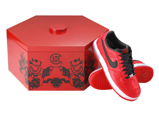
Just saw this and although it is not Puma, I particularly like the shape of the box, as it reminds me of the Trinomic process used in shoe manufacture. Yes I know the illustrations are bad but still it is a lovely box.

This is a particular favourite of mine, which isnt unusual considering it has something to do with cardboard or novelty items, but because it reminds me of when Puma used to endorse and sponsor the large events. Plus breakdancing is really something to watch and I only wish I had the physical stamina and endurance as the guys who can.


This is a particular favourite of mine, which isnt unusual considering it has something to do with cardboard or novelty items, but because it reminds me of when Puma used to endorse and sponsor the large events. Plus breakdancing is really something to watch and I only wish I had the physical stamina and endurance as the guys who can.
The branding is really uniform and the choice of using a limited colour pallete, basically only using black gives its simple delivery an easy one to identify with, as is the idea of branding and advertising.

This looks tech-savvy, by the way the craft of the box becomes more like a display within itself. Not to mention that it is made from super light, yet dense flute material. Imagine kevlar but for card. Potentially I think that I could use the interactive element of the design to direct me to some complimentary print processes, like spot varnishing or foiling.
Tuesday 20 October 2009
Tint or Gradient?


I especially like the hand rendered type which is something I would definitely want to look into more this year as part of my practice, along with the fluidity of the image with the type creates a lovely visual soup to feast your eyes upon. Quench your eyes in the visual audacity!


2 colour


These are both from the local legend Luke Drozd, both were screen prints then digitized to send off to the publishers. I particularly like the way the softer tints detract away from how macabre and quite graphic his work tends to be.
1 colour

Saturday 3 October 2009


Subscribe to:
Posts (Atom)
