Friday 30 September 2011

Steampunk Posters/Minimal Science

I was really struggling to find some up to date design to give me some direction/context to my own work.
Fortunately I found Megan Lee on Etsy selling some rather cool, minimal image-oriented posters that sum up the scientist in a form of a vector icon. Its sort of the look I was going for at the moment anyway, as the style of image making goes hand in hand with the science theme which obviously uses very simple icons and symbols to quantify and qualify certain elements within their chosen field.
The use of type is something I wont be learning very much from as there is nothing bu t the names and a date underneath which corresponds to the date of discovery concerning their field of work, be it something to do with quantum mechanics or chemical warfare.


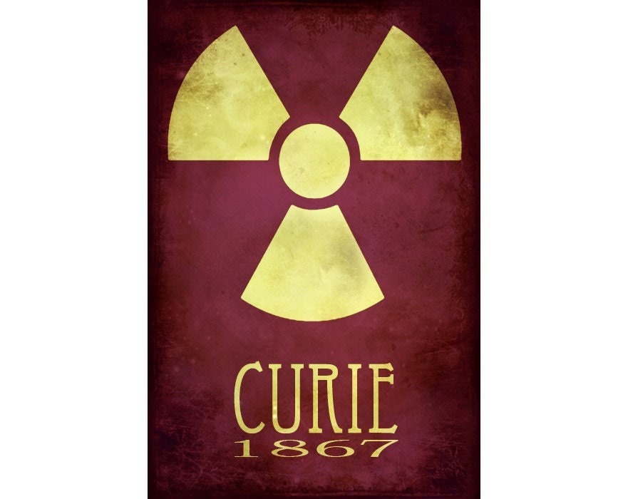
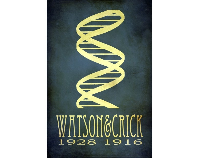
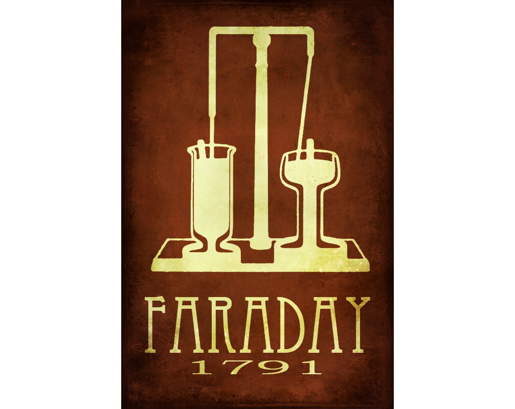
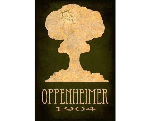
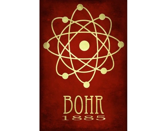
Rock Star Scientists is what Megan Lee calls this series, which I think is a really cool name, personally. Makes me consider if I am going to have a serious tone with the science brief, although I dont think I will as it will bore the hell out of the intended audience as well as anyone else.

NU WORLD MAG


This publication was designed by Diego Tang whose work is predominantly geared towards publication and digital imagery. I particularly like the layout and use of vectored images to compliment the text. There are alot of elements in the composition of type with image that I think is a little lavish/trying too hard but for the majority the layout and use of digital illustration really compliments the product as a whole. Something to take on board when considering layout for the science publication.

Monday 26 September 2011

Nuclear Catastrophe


Nuclear Catastrophe and Reactor Shutdown

Aftermath of largest earthquake in history


Remember, at the heart of every nuclear reactor is a controlled environment of radioactivity and induced fission. When this environment spins out of control, the results can be catastrophic.
For many years, the Chernobyl disaster stood as a prime worst-case example of nuclear malfunction. In 1986, the Ukrainian nuclear reactor exploded, spewing 50 tons of radioactive material into the surrounding area, contaminating millions of acres of forest. The disaster forced the evacuation of at least 30,000 people, and eventually caused thousands to die from cancer and other illnesses [source: History Channel].
Chernobyl was poorly designed and improperly operated. The plant required constant human attention to keep the reactor from malfunctioning. Meanwhile, modern plants require constant supervision to keep from shutting down. Yet even a well-designed nuclear power plant is susceptible to natural disaster.
On Friday, March 11, 2011, Japan suffered the largest earthquake in modern history. A programmed response at the country's Fukushima-Daiichi nuclear facility immediately descended all of the reactor's control rods, shutting down all fission reactions within ten minutes. Unfortunately, however, you can't shut down all radioactivity with the flip of a switch.
As we explored on the previous page, nuclear waste continues to generate heat years after its initial run in a power plant. Similarly, within the first few hours after a nuclear reactor shuts down, it continues to generate heat from the decay process.
The March 2011 quake manifested a deadly tsunami, which destroyed the backup diesel generators that powered the water coolant pumps and that the facility had turned to after it couldn't get power from Japan's grid. These pumps circulate water through the reactor to remove decay heat. Uncirculated, both the water temperature and water pressure inside the reactor continued to rise. Furthermore, the reactor radiation began to split the water into oxygen and volatile hydrogen. The resulting hydrogen explosions breached the reactor building's steel containment panels.
Simply put, the Fukushima-Daiichi facility had many countermeasures in place to shut down operations in the event of severe seismic activity. They just didn't count on losing power to their coolant pumps.
Plants such as Japan's Fukushima-Daiichi facility, Russia's Chernobyl and the United States' Three Mile Island remain a black eye for the nuclear power industry, often overshadowing some of the environmental advantages the technology has to offer. You can read more about exactly what happened in How Japan's Nuclear Crisis Works.
Explore the links on the next page to learn more about nuclear energy.

Britistics

This sort of links in with the sort of visual approach I would be using when looking at publication design for some of my briefs.
In a similar vein to Water Privatisation, the simple use of vector images with refined information would be the best method I believe for the sort of publication design I would be applying to my own work.
Could be used for game demographics/information regarding gamer statistics and be used for the pro-videogames aspect of myself and my work I will be trying to propagate this year.


Nuclear Cycle Brochure


Besides having a rather large interest in physics and nuclear energy, this certain subject is something that has become a sensitive area since the incident in Japan as well as having some significance in relation to my dissertation.


The problem is that there is not enough material to get a real idea of what the company does, and has only 3 pages of content. It does give me hope that someone out there is trying to not overcomplicate the delivery of such an amount of information whilst giving the final product a professional look. If I were to do something in this vein I would  steer away from using 3D illustration and try to utilise the use of vector illustrations for easy categorisation. 

Water Privatization

Since I was wanting do produce a publication that has something to do with world affairs, or a sensitive subject or something related to videogames, I found this example of how I would want a possible outcome to look.


The privatisation of ANYTHING that is meant to be available to the public is something I am wholly against. Admittedly I have my occasional elitist outburst of how a certain social demographic should be denied something, my overall view is that privatisation of public amenities is disgusting. If I could I would overthrow such decisions, as would many of the worlds 'unknowns' but alas it is far beyond my jurisdictional opinion and scrutiny. I would rather raise awareness, as it seems the only thing to do, unless a relevant protest would arise up from the proletariat ranks and overthrow any such tyrannical review of said amenities.


This aside, the clean, clinical look of the publication is something I would be aiming for. A minimal approach would be best, considering the majority of client led material (like the governments pamphlets on recycling) tends to leave a fluffy, unapproachable taste on my visual receptors. The design of such information is something that needs to be addressed as well as the issues at hand needs a clever enough delivery of information that doesnt bore, or over-excite (in terms of design choices) otherwise people will just do what I normally do, if it looks bad, chuck it away.


With the emphasis on designing a range to accompany whatever it is we are designing, say  a poster to go with the publication/website/promotional materials, Perin has also done an infographic poster that goes nicely with the publication.


The design was done by Perin Rambhia


Saturday 24 September 2011

Console Font


Thought this would be another good visual reference when doing publication, how the use of vector graphics can benefit the overall informative status  of a piece of design. Designed by Varun Vachhar.

Stop the Blame, Play the Game


All I can say is THANK YOU to Robert Shaw, the guy who is trying to address the issue that plagues the game industry and inhabits the majority of the middle class mindset that dominates this part of the Western hemisphere. 
Essentially, the debate tries to expose the liars, sorry politicians that propagate that video games are nothing but mere manipulation tools used to condition the unwashed, unabashed masses into some form of social revolt against the mindset of Western nations.
Far from it, this mini-documentary helps to provide a fresh look at gaming that should create new lines of enquiry when addressing the videogame issue in contemporary society.


Thursday 22 September 2011

Brief Writing

A refresher on design practice and what is expected was the forefront for the day, leading into a brief disassembling/writing workshop after.


The main points that were mentioned helped me to gain insight into what I need to be delivering, after a year out of the loop this gave me the relevant information needed to get some better framework.


The appropriateness of the response needs consideration to if it fits within my own strategy for this year and if the solution is relative to my own personal gains.
The quality of the response/resolution goes hand in hand with meeting the deadline, if the client likes the work you have produced yet you think it unworthy as a portfolio piece, do you take it back and redo it or just take the money and run?
Essentially all those points are asking is can I deliver a brief of a high quality and on time. 


Constant questioning of the brief and how relevant it is to the work I'm doing is something that will help in problem solving and stop the head scratching early on.
A basic framework, but still good to be refreshed on this:


What is the PROBLEM
Who is the AUDIENCE
What is the CONTEXT
What is the METHOD
               of DELIVERY


There was discussion on the rationale we are soon to finish writing which will essentially underpin the work undertaken this coming year. The body of work should be of a standard and presented in such a way that will pave my way to a career in industry.
With this in mind, I need to constantly question my work in order to create a critical dialogue with my work and myself that will inform rather than hinder what I am doing.
Another point brought up was the way that my work sits in context with selected audience(s) and how it would be placed in a reality situation, which is obviously trying to wean us off briefs that do not exist, essentially.
Next we moved onto the 3 basic frameworks for putting our work into a suitable context which could easily be a basis for the rationale writing tomorrow. (Which this seminar was obviously the precursor to.)


Creative Ambitions


I would say that my creative ambitions are generally centralised around illustration, branding and publication. I would like to extend my illustration and image making skills by making greater use of resources and materials by mixing media to gain better results.
Developing my digital skills to a much higher level, and making use of a wacom, as it would be great to get to grips with to make my illustration skills much more refined.


Ethical Concerns


At this moment in time, I would say that I am against anything to do with governmental schemes that leave independent businesses unable to function, the misuse of power to create shady corporate enterprises that compromise human rights and animal welfare.
I am unbiased toward green enterprises as statistics show it is industry that needs to correct itself if the planet is to advance into a new age and I am against the privatisation of public services as well as governmental schemes that try to bring down communities.


Commercial Desires


I would love to get my work published in journals, books, magazines and get noticed in general, as would open me up to the public which would in turn gain me interest and jobs. 
I see myself getting work in a game studio (hopefully) or some form of zine group that would be a great place to start getting myself known and my work seen.
Anything to do with self exposure would be detrimental to my professional advancement.


There is a need to define myself on all these levels in order to create a portfolio and a sufficient body of work to support my aims. Another consideration is the tone of voice in my work, will it be consistent? Will there be a visible dialogue of having humour, sarcasm, visual authority or seriousness in my work? It will become evident as I regularly re-evaluate and criticise my own work throughout the year.


Context, Function, Practice


Publishing & Editorial


Branding & Identity


Packaging & Information


Information & Wayfinding


These were the groups that were put forward to create a starting point for focussing in our rationale and in general the direction of our work from here on in.
Albeit these categories as set in stone, the statement of intent which would stem from these is not, as it will inevitably change during the course of the year.


Moving nicely into the last part of the day, which was creating a statement of intent in a very basic form, the structure given was:


A_______investigation of_______ with a focus on________


The idea is to come up with a statement that sums up our current and to-be practice in a little words as possible (10-15)


So in the session I came up with....


An illustrative investigation of scientific endeavours with a focus on composition


An illustrative investigation of type in games with a focus on editorial 


An informative investigation of world affairs with a focus on type


An illustrative investigation of video games with a focus on promotional and viral. Predominantly in digital format, but with scope to transfer into print based media.


An illustrative investigation of videogames, biking, science and current affairs with a focus on digital production, website building and print finishes.


A print-based investigation of science with a focus on typography, digital finishing, developed by hand.


Character driven, digital based illustration with a focus on videogames and science


Then after finding out that many of us were misled into thinking that this was the basic framework for our content, I came up with these smaller and more concise statements:


Editorial and print driven, focus on illustration and content.


Publishing and editorial driven, focus on illustration and format.


Content driven, publishing and editorial with a focus on illustration.


Publishing, editorial driven, focus on print and illustration.>


Content driven, branding and identity with a focus on illustration.


Monday 19 September 2011

Minimalist Game Posters

Thought that with the up and coming year I should post these now, as it would save me finding them again for visual reference. Not only that but I think it would be a great starting point for a brief and give me a good idea of where to go for the visual direction of a project, say for book publication, editorial or even a series of book covers, although I hopefully wont be applying it to something as mundane as book covers since Olly Moss beat me to it years ago.


All designs are by Boris Lechaftois.


Tuesday 6 September 2011

DXTR


After trying to find a decent illustrator that could demonstrate the sort of composition I'm after concerning science-related interests of my own, I stumbled upon DXTR on behance.
Typically the illustrative style is complex in composition and content, but it is the composition and layout of the overall piece that I'm referencing this designer for.


Utilising elements that are research driven and delivered in such a way that can be slightly chaotic at times. I critique this as I do because I wish to be of a level of professionalism as DXTR in terms of my individual practice reaching such a level towards the end of/during my year on the course that is left.


Dexter likes to cite various subjects in his work, especially pop culture and sci-fi which funnily enough is something that I too am interested in and when I actually do a focussed illustration it references them.
This year I think that by working on my portfolio and my illustration skills I would like to contact him and see if he would mind me talking to him about what he does and how he gets jobs, if he has any yet! Although he is situated in the UK, I would have to post my portfolio to behance to get into contact with him.