Showing posts with label BRIEF 1: GAMES AID. Show all posts

Monday, 17 October 2011

Jon Contino

Another idea of mine was to look at how I could make companies based on in game elements like:  Marios Garage (MarioKart) or Dantes Pizza Shop (Devil May Cry) or something similar. I wanted to keep the hand rendered type a main focus as I believe that it has more appeal to my target audience than clean cut often quite clinical vector based illustration.


Jon Contino is my next stop as I think his work is expressive yet reserved, often working in commission rather than freelance work, it gives my idea more weight and demonstrates the similar restraints when working with type. Since type is often my area of taboo, I think it would be best addressed on this brief, which allows me a little more creative freedom than the others.


Chris Piascik

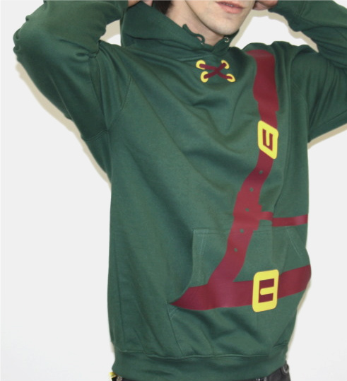
I figured that from the feedback at the last crit, I should aim to create a range of tees that have a breadth of visual styles as to try reach the various types of gamers out there. Not only that but it generates alot of illustration that is directive and will produce some good work that will be portfolio worthy. 
So I have been looking at hand-typography and how it could be applied to the nerd factor by means of highlighting certain aspects of games such as irritating moments, levels, characters or just down right wrong  elements of a game, from Navi to the Guildmaster.


For inspiration I looked at Chris Piascik mainly to grasp and idea of composition when looking at how the type resolutions would work. His use of colour is often vivid and impacting. This approach is similar to the one I am using for this brief. I am not sure if I will be sticking to the logo colours, although it may well be a consideration.


Tuesday, 11 October 2011

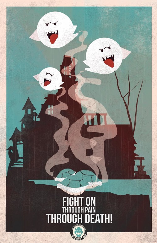
Mario Propaganda

Not entirely sure this is the route I will be taking, but I think its a good starting point for imagery and composition for my brief. 
The use of pastel like colour along with the heavily vector based imagery contributes to the effectiveness of the posters as they are high impact, using only a phrase to convey the message. A similar approach would benefit my own brief, taking one phrase and one image to effectively communicate the underlying issue through a very conventional means.
The humour is bang on what I was getting at in terms of how the tone of voice needs to be.
I think as a series/set they work fantastically and have the ability to be transferred into a multitude of media and products.
Fro is behind these posters and has done many many other designs for contemporary media, including Breaking Bad, 2001: Odyssey and Bioshock to name a few.


Saturday, 8 October 2011

Beyx

Just found some cool characters that have a similar style to what I want to develop for the Games Aid brief. Beyx uses simplified characters that highlight the main factors of the personality and identity of said fictional individuals. In a style similar to my own, the use of vivid colour will help to enhance and bring my own illustrations to life.


Admittedly they are a bit cutesy, but it is the technique of how they are produced I like. A good focus from this would be to maybe use photoshop more, as I can enhance my own work through mixing it up with textures and layers that cant really be done in illustrator with such ease.


Tuesday, 4 October 2011

Axel Pfaender

I absolutely love this guy, designing purely towards technological and gaming audiences using block vector illustration in such a variety of ways from the simple imagery to increasingly complicated compositional illustration that is often found on his limited edition prints.


This sort of style in terms of colour and image composition is the visual approach I would can most relate to and would like to be a part of. Using this sort of imagery and applying it to my practice may help to define what sort of style I have and how to capitalise on it.


This publication on MMPORGS is great as well, showing the uniformity of the characters on the basis that each of them has some sense of individuality. Above all I think the illustrations compliment the layout extremely well, the print finish appears to be of pro standard which is something to consider when Im approaching layout in publication


Monday, 3 October 2011

GLO


I figured that these double page spreads designed by JAV that I found on Behance were a good example of some form of press pack that will be used for the games aid brief. The use of a limited palette - if you excuse the full colour photos - and stocky vector work brings the harsh colours of the photos into context.
Although the front cover is far too much like a flyer for a freshers night, the choice of type is roundabout the same in terms of its slack application, the following pages really make up for the publication's presentation.

Saturday, 1 October 2011

Games Aid

Just thought I would put a little post on Games Aid, as I am considering getting rid of the Zelda Brief I proposed in my original design strategy presentation. Not just because I found out that the anniversary of Zelda was earlier this year so I wont be able to join in with the hardcore fans appropriately. Also a Zelda marathon was had in aid of children with disabilities so it has kind of put a dampener on my orginal idea.
I do think however that designing for this charity is worthwhile, not only are they raising money to better the lives of children all over the UK. 
In their own words -


"Funds will predominantly be used to support children's charities in the UK, with limited application for overseas causes; for education, health, housing and social welfare. Funds may also be deployed for career guidance and sport. Where possible, there will be some form of technology/interactive play element, but that is not a funding stipulation." 


Widely recognised and renowned by other charities in the UK, I think it is a great way to encourage what is perceived as a legion of lazy gamers to get together, do what they enjoy to help other kids have a much better life at the expense of some blue light exposure on our part.


Plus I can see myself having a great time organising this, getting everyone together and having all my friends and whoever else I can convince to take part and do something good for some else, AND have fun.

Able Gamers


A quick look at Able Gamers website and it becomes obvious that I have found another good reason games should be promoted as a positive force towards new horizons and new ways to revolutionise gameplay. They do a lot of good things for their community, and have lots of reliable links on many different people/companies from the games industry making statements on the good they do. Pretty handy starting point for my publication!
http://www.ablegamers.org/

Saturday, 24 September 2011

Console Font


Thought this would be another good visual reference when doing publication, how the use of vector graphics can benefit the overall informative status  of a piece of design. Designed by Varun Vachhar.

Monday, 19 September 2011

Minimalist Game Posters

Thought that with the up and coming year I should post these now, as it would save me finding them again for visual reference. Not only that but I think it would be a great starting point for a brief and give me a good idea of where to go for the visual direction of a project, say for book publication, editorial or even a series of book covers, although I hopefully wont be applying it to something as mundane as book covers since Olly Moss beat me to it years ago.


All designs are by Boris Lechaftois.