
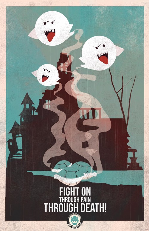
The use of pastel like colour along with the heavily vector based imagery contributes to the effectiveness of the posters as they are high impact, using only a phrase to convey the message. A similar approach would benefit my own brief, taking one phrase and one image to effectively communicate the underlying issue through a very conventional means.
The humour is bang on what I was getting at in terms of how the tone of voice needs to be.
I think as a series/set they work fantastically and have the ability to be transferred into a multitude of media and products.
Fro is behind these posters and has done many many other designs for contemporary media, including Breaking Bad, 2001: Odyssey and Bioshock to name a few.


No comments:
Post a Comment